Welcome to Diane’s Blog!
I’ll use this spot to chart what I enjoy and endorse, as we attempt to live a life of style in a culture of business and writing and art.
And I hope you join me; share your own stories, insights and ideas about living a creatively expressive life.
Thursday, May 12, 2011
For so many reasons, yesterday – which was, by all accounts, one of the ten best weather days of the year, will go down in my book as one of the best days inside the office too! Here are some of those reasons:
Yesterday we published my Short Story: Breakfast, The Talking Box, the first in a series of three that will come together to form: Breakfast, Lunch, Dinner, stories that look inside (with some humor and a good dose of self-criticism) my world of marketing, fashion, advertising and style. The stories are gossipy, a little sexy – and full of behind-the-scenes information, for those of us who love process. I know I’m not the only one out there!
Most of all, it’s MEIER’s debut as an imprint. And the look of the graphics, from the color of the cover to the illustration (encouraged by Ben and David and Frank from the doodles that appear on my pad at meetings) to Ben’s wonderful work on our proprietary design and title pages, was nothing short of a joy!
It’s $1.99 - as a download from Amazon/Kindle – for your Kindle, your ipad, your iphone, your android phone… the Nook takes a few days to load, but it should be there next week. And we’re looking at Smashword. For the moment, here’s the link to the Kindle store:
http://amzn.to/lNV6t7
But wait! as the Infomercials say, There’s more!
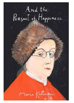
Our lunch guest, here at 907, was one of my heroes. The brilliant illustrator and painter – Maira Kalman. She was, in person, as generous and lovely and warm as her work. She’s off to Ireland on a series of projects, and Frank will try to make some good introductions to ease her way. But I’m already looking forward to seeing her again. She’s illustrated The Elements of Style. Something close to our hearts here at 907. And those of you who love The New Yorker are familiar with her covers. I am especially moved by her book, And The Pursuit of Happiness. Here’s the link:
http://amzn.to/joxjvv
And -- Even more…..
We celebrated Ben’s birthday and I’ll let you use your imagination when I tell you that there was some revelry in his Birthday Suit! Great fun – but no pictures, please!
Tuesday, April 19, 2011
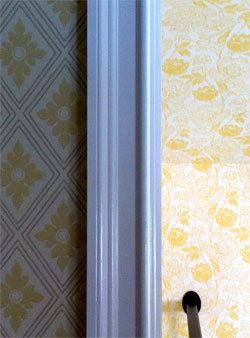
The flowers on the cover and the endpapers of The Season of Second Chances were taken from the William Morris papers Teddy used in Joy’s house. I love the flowers, I love William Morris’ designs and I love wallpaper. So does Frank. The bedroom floor of his house in England was blooming with wallpapers from Cole and Colefax & Fowler. We’ve used wallpapers a lot here in the office. And now we’ve used them at DogWood too. Come see --
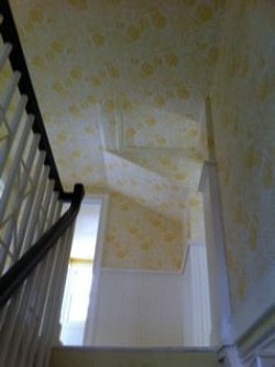
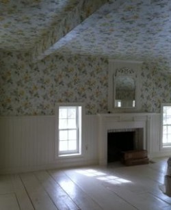
Because we wanted the whole of upstairs to work as a coordinated suite, we decided that the wainscoting and detailing would be the same height, scale and color, throughout the floor (Pointing/gloss), and that we would use wallpaper above the wainscoting – in
every room, including papering all of the ceilings. The nature of those ceilings, full of quirky angles and low pitches, needed something, I thought, that looked very deliberate to smooth out the problems; or -- if we were very clever, to make a feature out of them.
The wallpapers we turned to were by Farrow and Ball, except for the master-bedroom and bath, where a paper called,
Floral Trail, from Fairwinds Studios had been substituted at the last minute, for a Colefax and Fowler paper that originally formed the center of the whole design exercise. It was, at the eleventh hour, pronounced “Out of Print.â€
Talk about panic. Frank called England and tried to get C&F to print just enough for us – at any price. But nothing was going to happen fast enough to get the whole of the top floor papered within the year. I don’t know how the Design and Decorating industry manages to hobble along, if not forward, decade after decade. Time after time they disappoint consumers and decorators alike. The Colefax paper was lovely, the whole color scheme of the house had come from that paper, and it was damn near impossible to find something else in yellows, creams and grays that would give us the right Victorian period and the delicate balance of country and lush.
But we did find one. And isn’t it wonderful?
The coordinating papers came together rather easily. Farrow & Ball is just great to deal with, their selection is perfect for the age of the house, and we knew what we were looking for. Here was our thinking:
All of the papers on the floor would be coordinated, tied together with gray, creamy white, taupe and yellow. Frank wanted his bath to be sunny, with distinct and clear color, but we knew that his dressing room had to be more neutral than the bath, since the room’s purpose was designed for the coordination of his wardrobe. An exercise designed, after all, to see the forest for the trees. Here is our solution:
Frank’s bathroom and dressing room are the most deliberately coordinated on the floor in that they are the very same pattern produced in the positive and the negative. It’s a trick I saw Billy Baldwin use in my mother and father’s bedroom, bath and dressing room, nearly fifty years ago. We used a paper called,
Polka Square in both color ways.
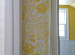
The wallpaper in the hallway is called
Peony, and it repeats the idea of little dots within the flower’s petals, tying together the two elements of bath, dressing room and bedroom perfectly.
Frankly, this paper became the biggest disagreement the two of us had in the entire job. I thought it would be far too competitive with the floral in our bedroom. But Frank knew that the pattern of yellow and white would work as a neutral without our having to be more conservative. And the angles of that hallway required something of that scale and movement that would smooth their aggressive juts and jags. And was he right! I just love it.
The guest bedroom has my childhood brass bed. And it’s anything but girly. We wanted a paper that any guest would be comfortable in, regardless of their gender. So – a more geometric paper was chosen. The wonderful
Ranelagh takes down the yellow with a dollup of cream, bit of drabware and gray. Perfect with the brass, don’t you think? Wait until you see this room furnished. I can’t wait.
Guest bedroom and hall pic
Here is the website for F&B. Take a good look at their papers and see if you don’t see something just right for your own project. Here’s a great spread in this current issue of House Beautiful, using F&B’s Ringwold in turquoise. Just great.
No wallpaper is planned downstairs beyond William Morris’ Willow paper in the guest bath. I installed it ten years ago and loved it. Frank agreed, and Jeff and his team managed to protect it through the renovation.
I think we may wallpaper the inside of the doctor’s cabinet/cupboard and the big book case in the kitchen, both of which flank the doorway. And – even though I named DogWood Farm - not for the tree, but for the stick I threw to my beloved German Shorthaired Pointer, I’ve painted a fantasy tree in the foyer. Let’s see if that can withstand the last efforts of renovation. It’s already been scraped and nicked, and now we have to paint around it. Shall we begin to take bets on it’s chances of surviving? Mural pic – or not?
Maybe the idea of painting things – all things – in renovation should be next on our agenda. Frank says that if he stands still too long, I might paint him… So stay tuned!
Thursday, March 24, 2011
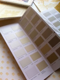
Color: In The Season of Second Chances, people keep reminding our main character, Joy Harkness, of her ‘colors’. She’s bewildered at the concept; in keeping with the fact that she is clueless about so much that is personal or style related, including the colors that flatter her. But when Teddy creates a palette for Joy’s house, he lets us see her. And I know I’m not the only one to suspect that her hair is auburn and her eyes are green, without ever being told so on the pages of the book.
The Farrow and Ball colors Teddy chooses for Joy are: Dorset Cream, Farrow’s Cream, Hay, Pale Hound, Cooking Apple Green, Folly Green. Teddy paints Joy’s ceilings in Borrowed Light, but only I know that. If he mentions the color, we don’t hear it.
It’s no coincidence, I suppose, that the colors of Joy’s house are the colors I first used in my house in Connecticut. I had, so carefully, chosen those colors a little more than ten years ago, when I first bought the place. And -- much of SoSC was written on the laptop in the guest room, surrounded as I was, with Farrow’s Cream. We were amazed to discover that the colors were almost identical to those Frank had used in his own house in Somerset, an ocean away.
But as a marketer, I know that the “eye†wants change and stimulation. I don’t believe that for most of us, taste changes much, but I do believe that we can experiment with color in ways that make our taste – the embodiment of our personality – feel fresh and vital. So it didn’t really surprise me that when we began to talk about the renovation of the house, we realized we wanted to update the colors.
Our first inclination was to use strong, fresh color. But a look at our references suggested that we were gravitating to almost no-color-colors. The kind of background neutrals that set the stage for a burst of something daring. Perhaps that bold use of color didn’t need to be fixed; like using a raspberry tablecloth in a soft gray room one week, and changing it to leaf green, or sky blue, for another day or another table-setting. Suddenly that kind of flexibility looked creative to us. And knowing that we wanted this approach to color was the insight that helped to determine the palette.
So, that’s the inspiration. Now for the cold reality. The house is dark. Upstairs, especially, the windows are small and low. We’re surrounded by grand old 200 year old maples that keep the rooms shaded and cool in all but the worst summers. But they also keep it dim. We knew that we wanted to treat the house as a unit, with colors and a coordinated palette blending from room to room. But the idea of gray or taupe on the walls upstairs stretching through the long, dark days of our New England winters, suggested a set from The Seventh Seal.
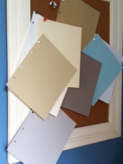
Years ago, all of the rooms upstairs had been coated with Farrow’s Cream as a place holder until I could get around to dealing with proper decorating. It’s soft, warm color was never depressing, it seemed to seek out the sunlight and expand it. Even though it had been intended as a stop-gap, it had been neutral enough to work in every room. And there was our idea: Use yellow as a neutral and mix it with a lot of white and cream, stirring in bits of grays and taupe to coordinate it with the rooms downstairs. Additionally, we made a mental note to use dollops of yellow downstairs, which wouldn’t be difficult. From our collection of yellow-ware bowls to yellow gingham, it’s always been a favorite.
Here is the palette of the house. It began a bit more simply, two whites, not three. One taupe, not two. One gray. A blue for the ceiling. But it’s an old house, and we didn’t want it to look too coordinated and too matched. We wanted the play of change off the surfaces. And the surfaces themselves determined so many of the choices. But that’s another conversation. So -- tune in again, as they say, for the next adventure --
Monday, March 14, 2011
Wouldn’t it be great if design projects could come only from a place of creativity, fueled with enough money to make all options possible?
I’ve been around renovation, restoration and decorating since before I could stand up in a crib – and trust me, waiting for the day when this work is nothing but well-funded fun, is like waiting for the tooth fairy. On top of it, far too often these projects start with something close to a disaster. And -- regardless of the nature of the problem, it’s never a good time. All to say, very few of us will ever approach this kind of work with a calm head and ‘extra’ money. I know that we didn’t.
When it was clear that we were going to have to gut most of the house, the options of change were enormous. Where to start? Well, I knew we couldn’t raise the roof, and – at least on this stage of development, we wouldn’t change the footprint. We chose to have plumbing stay where it was, with some minor changes. But interior walls could move. Detailing could be added. Doors and hardware could be upgraded. Bathtubs could be bigger, or they could become showers. We could have storage and closets, insulation and thermopaned windows – the things an 1830’s house (with a hundred years of badly informed and executed accretions) weren’t giving us.
So that’s a good place to start. List the challenges, and embrace your limits: the things you can’t do, won’t do, can’t afford. Talk about them. Negotiate, if you have to, or you’ll be floating free, with no way to frame your choices or your options. Limits are the very thing that begin to give a project shape. They gave us the freedom to create a sliding entrance out of a 19Century door, and to trade a shower for a closet. Because we didn’t want to pay for major moves of plumbing, we knew where we had to steal 6 more inches to enclose a deeper, wider, soaking-tub. These were very practical beginnings. But vital.
As far as aesthetics, we also knew that we didn’t want to lose the quality inherent in the age of the house and its elegant small, square rooms. In fact, we wanted to enhance this authentic quality. We did not want to lose the wonky, tilted floors or the scrambled angles in the upstairs ceilings. Clearly, we would have to do this with a very light hand. And a lot of reference.
I’ve collected design books since I was a teenager. I go through them more than you’d think – and I mark their pages with post-it tags. Just as Joy Harkness does in
The Season of Second Chances. Between my books and the stacks of design magazines through which I forage, hunting the thing that makes my heart beat faster, I mark and tag, tear out and note, until I have hundreds of references. Before we did a thing, Frank and I reviewed them, talked about everything, and saw things with new eyes as we did so. I don’t always know what I mean by what I’ve marked until we look at all of the things we like, laid out together for comparison, and then we see it:
Ahhhh! Only when we saw them together did we see that most of the floors were painted and light. Or that many of the walls were patterned. A color palette emerges. Another recedes. We thought we wanted color, but the things we liked best had very little, but when it was apparent, color was powerfully used. Most of all, we saw trim detail. Wainscoting, picture rails, floor and ceiling moldings, visible beams in the ceilings. The things we liked looked authentically old and worn, but they also looked polished and loved. And things begin to make sense.
We could see from those pictures that craftsman’s detailing was inherent in the looks that we most liked. It meant that the rooms themselves might stay, for the most part, very much the same in structure, but very different in detail. And that was a major insight. Surface and moldings, hardware and paint were going to be important. And, we agreed that as much of it as possible should be handmade. We were very lucky in that we had the supremely talented craftsman, Jeff Memoli, heading up our team.
So – in approaching design: Limits and inspirational reference. Somewhere between the two you’ll discover your project.
Next, we’ll begin to move inside. Hold on to your hard hats.