
Restoration of Joy #5: Wallpaper
Tuesday, April 19, 2011
The flowers on the cover and the endpapers of The Season of Second Chances were taken from the William Morris papers Teddy used in Joy’s house. I love the flowers, I love William Morris’ designs and I love wallpaper. So does Frank. The bedroom floor of his house in England was blooming with wallpapers from Cole and Colefax & Fowler. We’ve used wallpapers a lot here in the office. And now we’ve used them at DogWood too. Come see --
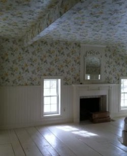
The wallpapers we turned to were by Farrow and Ball, except for the master-bedroom and bath, where a paper called, Floral Trail, from Fairwinds Studios had been substituted at the last minute, for a Colefax and Fowler paper that originally formed the center of the whole design exercise. It was, at the eleventh hour, pronounced “Out of Print.â€
Talk about panic. Frank called England and tried to get C&F to print just enough for us – at any price. But nothing was going to happen fast enough to get the whole of the top floor papered within the year. I don’t know how the Design and Decorating industry manages to hobble along, if not forward, decade after decade. Time after time they disappoint consumers and decorators alike. The Colefax paper was lovely, the whole color scheme of the house had come from that paper, and it was damn near impossible to find something else in yellows, creams and grays that would give us the right Victorian period and the delicate balance of country and lush.
The coordinating papers came together rather easily. Farrow & Ball is just great to deal with, their selection is perfect for the age of the house, and we knew what we were looking for. Here was our thinking:
All of the papers on the floor would be coordinated, tied together with gray, creamy white, taupe and yellow. Frank wanted his bath to be sunny, with distinct and clear color, but we knew that his dressing room had to be more neutral than the bath, since the room’s purpose was designed for the coordination of his wardrobe. An exercise designed, after all, to see the forest for the trees. Here is our solution:
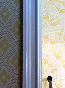
Frank’s bathroom and dressing room are the most deliberately coordinated on the floor in that they are the very same pattern produced in the positive and the negative. It’s a trick I saw Billy Baldwin use in my mother and father’s bedroom, bath and dressing room, nearly fifty years ago. We used a paper called, Polka Square in both color ways.
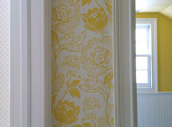
Frankly, this paper became the biggest disagreement the two of us had in the entire job. I thought it would be far too competitive with the floral in our bedroom. But Frank knew that the pattern of yellow and white would work as a neutral without our having to be more conservative. And the angles of that hallway required something of that scale and movement that would smooth their aggressive juts and jags. And was he right! I just love it.
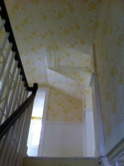
Guest bedroom and hall pic
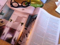
Here is the website for F&B. Take a good look at their papers and see if you don’t see something just right for your own project. Here’s a great spread in this current issue of House Beautiful, using F&B’s Ringwold in turquoise. Just great.
No wallpaper is planned downstairs beyond William Morris’ Willow paper in the guest bath. I installed it ten years ago and loved it. Frank agreed, and Jeff and his team managed to protect it through the renovation.
Maybe the idea of painting things – all things – in renovation should be next on our agenda. Frank says that if he stands still too long, I might paint him… So stay tuned!