Welcome to Diane’s Blog!
I’ll use this spot to chart what I enjoy and endorse, as we attempt to live a life of style in a culture of business and writing and art.
And I hope you join me; share your own stories, insights and ideas about living a creatively expressive life.
Tuesday, October 18, 2011
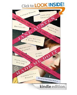
A little more than a year ago, my agent, Mitchell Waters, invited Frank and me to be part of a project he was agenting:
Jane Austin Made Me Do It, an anthology of short stories about or around Jane Austen. He suggested that we try writing it together and we thought the idea sounded like fun. It was!
Our story is called
Faux Jane, it’s about a con that attempts to pass off a copy of
Pride and Prejudice inscribed by Jane herself. And the couple who uncover the sham might remind you of another pair of spare time sleuths. They’re glamorous, witty and very urbane and we enjoyed the process of inventing them so much, we’ve decided to do more. But for now – we hope you enjoy our story!
Buy it on Amazon here!
Thursday, September 22, 2011
About a year ago, Mitchell Waters suggested that he might want to try placing a short story or two of mine. To his surprise, I quickly admitted that I'd never written one. Having an agent ask for submission is reason alone to give a new form a try - and I did just that. But first, I asked Frank Delaney, my live-in writing authority for direction.
"A short story," Frank said, "unlike a novel, should be something you can completely walk around. It's a morsel you can hold in your hand and turn over. And, ideally, it's utterly digestible." How could I not consider the dinner table as an option. One of my favorite movies, My Dinner With Andre, holds out an entire world for your consideration in the rich conversation of two very different friends.
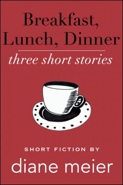
Dinner was born of that insight. My first short story. Lunch and Breakfast developed from the conceit, which I continue to appreciate as a device to bring folks together and force them to talk to one another.
Cocktails, on the other hand, was lifted whole, as a full chapter, out of a novel I'm working on right now. And, at least for me, it seems to have that rare quality of being able to stand on its own, without the rest of the book. I hope you agree. Given the fact that the content of the stories in this anthology seem to be focused around "Meals", we thought the cocktail party theme might allow us to sneak it in as a bonus for you.
The basic theme holding all of the stories together is neither food nor company; but rather, the idea of "positioning" as a deliberate and creative expression of life. In my first book, The New American Wedding, the expression of personal style as an authentic and powerful gesture in ritual, became immediately apparent to me. And certainly the lesson Joy Harkness runs into in The Season of Second Chances, is that style is a mark of emotional importance. Not something to be scorned as domestic and insubstantial, but rather, the "texture of life".
All of these stories serve up some level of personal, positioning for scrutiny, but I present them, I hope, with some, admittedly skeptical - if not wholehearted, reverence. If my brand of reverence is more ironic than what you might imagine to be encouraging, forgive me. It's my mark.
I've done a lot of thinking about this. Sondheim was wrong. It's not "Children and Art". It's only Art. Your children are going to do what they're going to do and your credit can and will only go so far. But along with your discovery of zutonium and the symphony you wrote in your junior year, your personal, authentic style, is all you really have to leave on this earth. The way you did it. The way you seasoned the soup. Or folded the napkin. The still life you've assembled on the dresser that mixes uour grandmother's pitcher with the little plastic gorilla who spits fire when he walks. The music that plays through dinner. The color of your socks. This is your art. If you're vigilant and let them speak, all of these things have a chance to say something about you. Not about fashion or this year's colors - but about you.
And my stories, I hope, encourage that kind of courage.
Buy Breakfast, Lunch, Dinner on Amazon!
Thursday, June 09, 2011
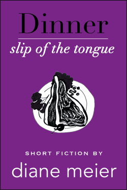
Third in the Series of Three Short Stories: Breakfast, Lunch. Dinner (ORDER HERE)
A very good editor can manage, without ripping your heart out, to trim the tics and cringe-making bits of style you persist in sprinkling through text that was “just good enough†to have caught their eye in the first place. But a great editor can also spot the thing you do especially well, and get you to do much more of it. I was lucky. I had that wonderful kind of editor in Marjorie Braman, who shepherded
The Season of Second Chances into print.
After a lifetime of watching clients try to remove the best and most original things from our work, I knew how rare a spirit it was to be drawn to and not put off by the more original stuff of talent. In my case, Marjorie took pages and pages of story and asked me to re-write them. My heart began to sink. “There’s nothing wrong with what you have here,†she said with firm authority, “in fact, it’s really good. But dialogue is very hard to do well. Very few authors make it work.†I remember assuming that I was about to hear that I was one of those many writers who couldn’t make it work. To my surprise she continued, “-- but you do it really well.†Holy smoke. “What you need to do is show it off more.†Talk about motivation.
Once, a long time ago, after a particularly wrenching tumble, I saw an orthopedic surgeon, who approached me with the greeting, “Swimmer?†I must have looked surprised, because, of course, that’s just what I was – far more at home in water than on land. He listed his observations: short torso, powerful upper body, extra-long limbs, hyper-extended knees. “If you’re not a swimmer,†he said, “you should be, because you were designed for it.†Designed? I must have queried. And he said something like – “great athletes often exploit the deformity.†It was a shocking line. The deformity. “Well,†he explained, “the baseball player with the double-jointed shoulder, the basketball star who is seven feet tall, the swimmer with extra-long, hyper-flexible legs… these things aren’t normal... but these are the things that often create an athlete’s advantage.â€
So –a long way of explaining or excusing that
Slip of the Tongue is nothing but dialogue. My homage to Malle’s
My Dinner with André, uses the conceit of a piece where there is, essentially, no action at all beyond the ideas raised in conversation over dinner. Keep your ears peeled as a table full of media, art and publishing types meet at the Waverly Inn and haggle over the meaning of positioning and establishing value in contemporary life. References to Sontag and Barthes, Chanel, Hermes and Henry James bounce around, as we decide what’s real, what’s necessary, what’s status, what’s stature. And - is it the most important question, the difference between self-protection, self-deception and self-indulgence? Or is that just another question about comfort in one’s skin, a prickly tangent to the necessity of positioning and its part in creating opportunity.
Tuesday, May 24, 2011
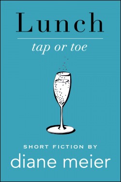
My latest short story, Lunch: Tap or Toe, is up on Kindle and about to show up on The Nook, etc.
For so many reasons, developing these little shorts is so different, in process, from
The Season of Second Chances. Closer to the bone, I’m not afraid of being ‘off putting’ to a larger audience. These stories are very ‘insider,’ and, I think, wickedly funny. Accent on wicked. I am writing, mostly, to please myself – and it’s a great experiment.
The Season of Second Chances was far more collaborative. For good and bad I think, The response to SoSC was so generally warm and favorable that I can hardly complain. But a lot of credit has to go to my extraordinary editor, the wonderful Marjorie Braman, who advised me to take a little of the sting out of Joy Harkness. Doing so without losing Joy’s sharpness was a challenge; though I think we got there. And lo and behold, those readers who didn’t warm to the book, often mention the fact that Joy is hard to like. No kidding, I think when I read one of their reviews. You should have seen her before Marjorie.
Interestingly, the most positive and satisfying reviews –both consumer and professional, talk about the fact that the reader is included in an option of changing their opinion (their second chance), at least about the main character. That’s part of the fun of the book. Those who ‘get’ it, seem to have enjoyed the chance. Good for them. Good for me.
This time out, with
Breakfast, Lunch and Dinner, I’m on my own – as much an experiment as anything else. The first story has been out a week and is already in the top ten of Goodreads Short Stories. Hooray!
But – remember, I’m a marketer. I want to understand and share with you all the things that work and the things that don’t work. And nice as my reviews are -- we’ve not sold a zillion stories.
So – I ask you – is there something that requires a dampening down of personality if you intend to satisfy a larger audience? Is it possible that I’m projecting a negative and reactive response to “professional judgment†designed to engage as large a group as possible?
Is my own ‘voice’ self-indulgent and far too narrow for a professional approach to writing? Or do we all need to hone that personal voice and hold on, until an audience, no matter how big or small, takes hold?
I’d love your thoughts.
In the meantime, here’s Lunch. Dinner is not far behind.
Description of Lunch:
Park Avenue Billionaire with big appetites and an even bigger sense of entitlement calls upon a childhood friend for a favor. Not exactly a romp through the stylish, New York world of Marketing and Money, but a witty and yet critical glance from a front-row seat.
Tap or Toe, the second of a series of three short stories
(Breakfast, Lunch, Dinner), takes you behind the scenes in the lives of characters who create the images we come to recognize as Status and Style.